LEON BOESLING

ART DIRECTOR


Brand Identity & Packaging Relaunch
Göing
Client info
Bakery – Hannover, Deutschland
Year
2026
Project info
Bäckerei Göing from Hannover had a fragmented visual presence that lacked a cohesive narrative. We took the brand back to the drawing board to orchestrate a full-scale Corporate Design relaunch, turning that visual noise into a clean, unified brand experience. We redefined the core identity, from a new, curated color palette and a modern photographic aesthetic to bespoke patterns and unique design assets. The result is a brand identity seamlessly integrated into their entire packaging ecosystem. Now, every bag, box, and wrap feels like a deliberate piece of the same story. It’s consistent, it’s elevated, and it finally reflects the quality of their craft, turning a wild appearance into a sharp, recognizable brand presence.
Roles & Credits
Art Direction by Leon Boesling
Graphic Design by Leon Boesling &
Sven Kasten


Productcentric and high impact, but visually disconnected. These served as isolated, short term signals that failed to translate into a lasting brand identity.
Our starting point. A broad, highvariety palette that served the brand’s initial growth but lacked the streamlined discipline of our new visual identity.
A purely task oriented view of team culture. It prioritized immediate visibility over the deeper, more human narrative the brand actually possesses.

Old
New
Becher in Nullkommavier


The Base Colors

The colorful touch
A curated, vibrant shift to brown, pink, blue, and green. We’ve replaced our fragmented past with a modern, disciplined system that feels fresh, intentional, and unmistakably Goeing.


These posters distill Goeings new identity into high-impact communication. They replace past clutter with intentional design to ground the brand’s craft in a sharp, modern aesthetic.
These cups translate the new identity into a daily ritual, turning takeaway essentials into bold, tactile brand statements.
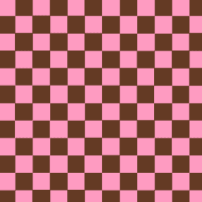
These checkerboard patterns anchor the brand with a modern, modular rhythm. By pairing bold, unexpected colors, they unify the packaging into a distinct, high impact visual system.
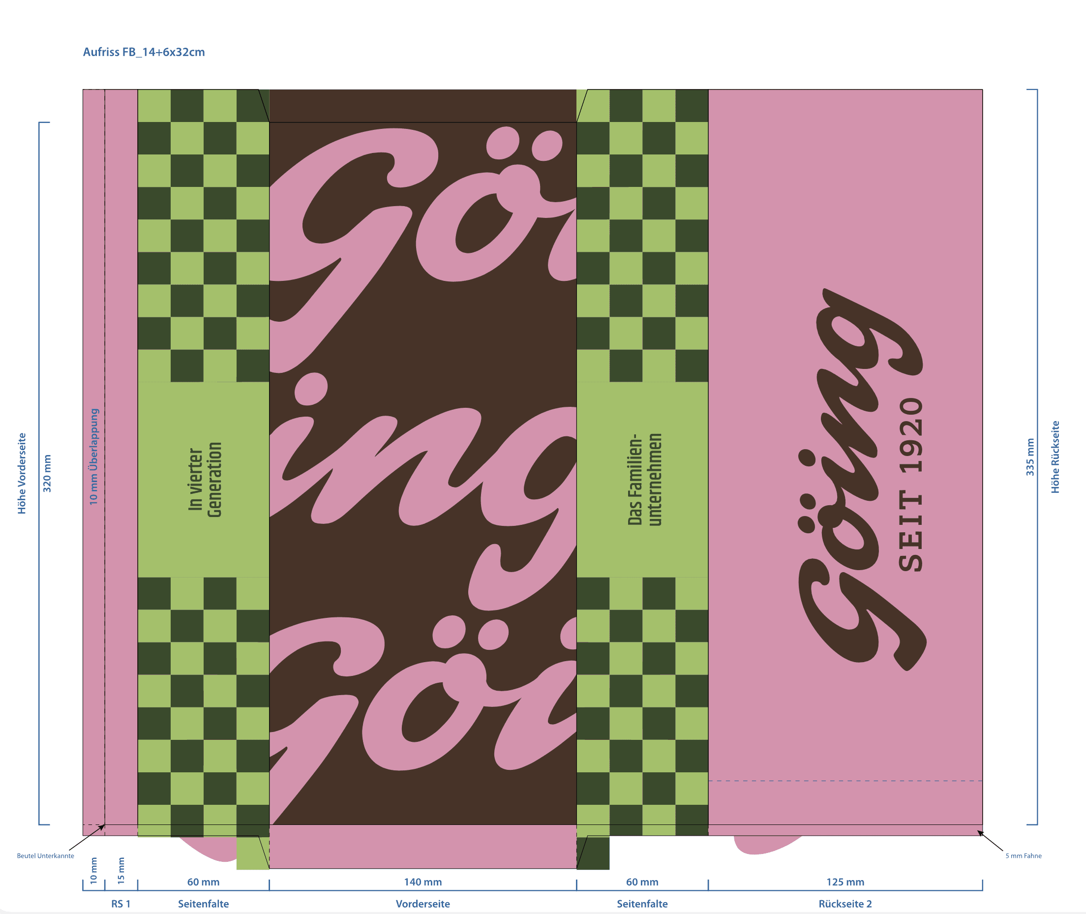

The packaging redesign injects a vibrant shift into the brand, moving away from conventional bakery aesthetics.


By pairing bold, unexpected color combinations with a playful checkerboard pattern, the new bags turn everyday takeaway into a confident, tactile statement of Goeings identity.